Rules.
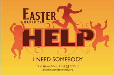
I need your gut reaction on our working promo piece for our Easter service.
Comment away.
Our Easter promo. I need your gut reaction.
Written by evan on February 27, 2008 at 10:01 PM
18
comments
Categories:
graphic design,
holidays,
sermons
Share this post - Email This
i
Subscribe to:
Post Comments (RSS)


18 Responses to "Our Easter promo. I need your gut reaction."
February 27, 2008 at 10:38 PM #
I love the Beatles idea thing you've got going here! Very fun!
I'm not crazy about the colors...Not into yellow/browns/oranges, especially for Easter... Maybe some blue tones instead?
February 27, 2008 at 10:47 PM #
i like the design.. but the colors make me think of flames.. my roommate thought the same thing
February 27, 2008 at 10:49 PM #
I agree, maybe try some different colours.
February 27, 2008 at 10:58 PM #
Bright. Desperate. Red.
There it is. An authentic gut reaction.
February 27, 2008 at 11:07 PM #
Like everyone else, the graphics, I love. The colors, not so much. I'd think in greens or blues or a combination of both. I am digging the theme of it though!
February 27, 2008 at 11:07 PM #
I like the warm colors. The original Cirque Du Soleil artwork is very inviting. If I was not familiar with it though, I might think otherwise.
When coupled with the word "Help" it kinda does look like flames. And the focal point kinda reads like "HELL-p".
I would suggest moving the bottom type that reads "I NEED SOMEBODY" closer to the word help. Although it is not what Soleil did, it will connect the dots much faster. I like your direction.
February 27, 2008 at 11:13 PM #
I like the colors. If you feel you need to change them, add in warms pink/magenta to what you've got, not blue. Something does seem off about the brown. It feels a little harsh. They're similar to the colors in the new Apple iPod ads, and you've got a similar flavor going on. I don't like the dropped letter "T" in Easter - it looks "busy" and you don't really need it. At least you didn't make it into a cross, which would be too cheesy. I like the swirls. I'd add more of them coming in from the edges. And maybe some wear and tear, paint spatters or texture that would give a little feeling of depth. Overall it's nice. That's my gut reaction.
February 27, 2008 at 11:23 PM #
The dropped letter "T" is a throwback to the Beatles font/logo.
We old fogies will get that. :)
February 27, 2008 at 11:39 PM #
definitely needs more swirls! :) there's lots o dead space around the edges... just don't make it too busy.
February 28, 2008 at 4:29 AM #
not a fan of all the oranges. I'd have used a more modern theme... most younger people won't get it.
too much "white" space.
February 28, 2008 at 6:45 AM #
The one thing I found a little weird is in the word H ELP all of the letters touch except the H and the E.
February 28, 2008 at 7:31 AM #
This is silly, but in a good way. Definitely evokes the whole "Beatles" vibe. I like the dropped letter "T" and think it works.
I agree that the colors could be tweaked to be more "easter-y."
I'm not qualified to weigh in on the white space.
Overall, a pretty neat little design.
February 28, 2008 at 7:43 AM #
Something about "Easter" plus "HELP" doesn't fit. I think there needs to be some white involved, and somehow get the focus off of "Easter", because, believe it or not, that's where my eye keeps going. The rest is almost too busy with no real understanding of what's going on.
February 28, 2008 at 8:25 AM #
It made me think of flmaes when I first saw it and thought that was an odd fit for easter...definitely an attention grabber.
February 28, 2008 at 8:52 AM #
Now that I've thought about it, I agree that a color-change should/could be an option. And "Easter" doesn't seem to be connected very well. That is, it doesn't seem to be standing out as much as it should. Good job though.
February 28, 2008 at 11:42 AM #
I don't love how it looks. It's a little to 'broadway/cirque du soleil' performance' looking... but that's what youre going for obviously. The words presented in another, less chaotic, way would probably suffice to get that song in our heads...
February 28, 2008 at 1:13 PM #
First gut reaction--I thought that was an awesome graphic design!
When I saw it was for Easter, my next gut reaction was that it's a bit edgy and intense for a traditional Easter service--but that would depend on what approach you're looking for. If your targeting an edgy topic, aiming at an audience that would relate to that, then go for it.
February 28, 2008 at 3:31 PM #
A wee bit fire and brimstone for my Easter goodness. I'm not saying use a bunny or anything - but seriously my gut reaction was that it said Easter Hell and I'm pretty sure that was all just from the colors.
Post a Comment